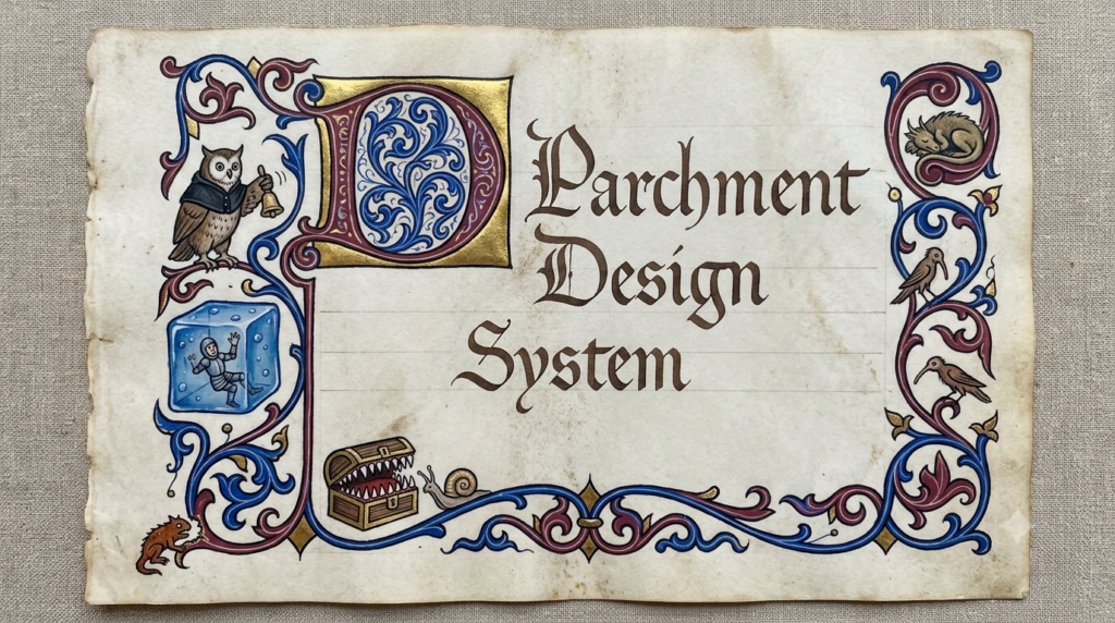
For about two years, every tool on this site was built with Cedar, the open-source design system I worked on while I was a software developer at REI. That was a deliberate choice and, for a long time, the right one. Cedar is accessible by default, thoroughly tested, and I knew every component in it. When you are one person shipping a suite of generators, starting from a design system you already know is worth an enormous amount. I got to spend my time on prompts and dungeon layouts instead of arguing with myself about button padding.
Then I started actually using the tools at my own table, and something kept bothering me.
Cedar is excellent. It was the wrong fit.
Cedar was built for outdoor ecommerce. It is bright and clean, and organized around getting someone from a product photo to a checkout button. Every one of those qualities is correct for selling tents. None of them are correct for a page a Dungeon Master reads at the table.
The tools were producing good content. A generated NPC would come back with a real personality, a distinct voice, a set of relationships worth playing. Then it rendered in a crisp sans-serif inside a card that could have been a shipping confirmation. The content said “sourcebook.” The interface said “SaaS dashboard.” Everything worked, and nothing felt like anything.
That gap matters more than it used to. There are a lot of AI tools now, and most of them look the same: the same neutral grays, the same rounded cards, the same interface you have seen a hundred times. When the underlying models are available to everyone, the thing that separates tools is whether they feel like they were made by a person who cared. Generic is a real liability.
Looking at manuscripts instead of websites
So I stopped looking at other apps for reference and decided to choose colors that would mimic a medieval manuscript. When I was doing this research two colors jumped out at me: Lapis Lazuli and Burgundy.
Lapis is the obvious one. Ultramarine was made by grinding lapis lazuli, a stone that came overland from Afghanistan, and it cost more than gold by weight. You did not spend it on ornament. You spent it on the things that mattered most. It carried importance because it was expensive enough to mean something.
Burgundy has an even more useful history for a designer. Red earth pigment was what scribes used for headings, initials, and instructions to the reader. The Latin for red earth is rubrica, which is where we get the word rubric. The red ink in a manuscript is literally the structural markup: this is a heading, this is where a new section begins, this is the part that tells you how to use the rest.
Once I saw that, the palette stopped being an aesthetic preference and became a rule I could actually build on.
Color has to mean something
The parchment system has one load-bearing rule, and everything else follows from it:
- Burgundy is content. Titles, proper nouns, the names of things, the small-caps labels that structure a card. It is the rubric ink. If it is burgundy, it is part of what you are reading.
- Lapis is the tool. Buttons, form labels, navigation, anything that belongs to the machinery rather than the document. If it is lapis, it is something you operate.
- Red is destruction, and nothing else. Delete gets its own register so that a delete button can never be mistaken for a heading.
The practical effect is that you can tell what a thing does before you read it. That sounds small. In a suite where seven tools all produce dense text, it does an enormous amount of quiet work.
Surfaces followed the same logic. Everything you read sits on cream, the color of aged paper, and everything carries a very subtle paper grain: a CSS texture that mottles the cream the way real vellum ages unevenly. It runs at four percent opacity, which is low enough that most people never consciously notice it and high enough that removing it makes the whole page look flat. The chrome around the document stays clean. Texture belongs to the page you read, not the frame you hold it in.
The part that actually matters: readability
Here is the thing I did not expect. The redesign barely changed what the tools do. What it changed was how much work it takes to read them, and that turned out to be most of the value.
Some of what came out of the migration:
Two tiers of emphasis instead of one. My first pass made every emphasized term burgundy and bold. It looked great on an NPC description, where the emphasis lands on a few proper nouns. It fell apart completely on a magic item or an encounter, where a dozen mechanical values all want attention and the page turns into a thicket of bold burgundy. So emphasis split in two: burgundy bold for narrative anchors like names and factions, used two or three times a paragraph at most, and plain ink bold for mechanical values like AC, damage, and distances. Dense pages now read as prose with findable numbers.
Real type instead of faux bold. Everything you read is Source Serif 4 with genuine weight files loaded, so bold text is an actual bold cut rather than the browser smearing a regular one. It is the kind of thing nobody notices and everybody feels.
One card anatomy everywhere. Items, NPCs, settings, monsters, and factions all share a structure now, so learning to scan one teaches you all of them.
Editing where the content lives. Fields turn into inputs in place on the card. No modal, no separate form, no losing your place.
Loading states shaped like the content. Skeletons that match the card that is coming, so the page stops jumping around while a generation finishes.
Sentence case on every button. Small change, much calmer interface.
I also wrote acceptance tests as part of the migration rather than after it, which is not a glamorous detail, but redesigning seven tools at once without a safety net is how you ship a beautiful broken thing.
Writing it down
The last piece was documenting the whole thing. There is a file in the repository called parchment.md that describes the system as it actually exists, including the places where it is still inconsistent and my honest notes about which of those are worth fixing and which are special cases I had a reason for at the time.
That document is why the system holds together. Every time I sit down to build a new surface, the accumulated reasoning is right there instead of locked in my memory of a decision I made in June. When I added the statblock converter last week, it took about twenty minutes to make it look like it belonged, because the answer to every question it raised was already written down.
The tools do the same things they did before. They just finally look like they know what they are for.
Leave a Reply